


Introduction
Material design is everywhere today; even now if you’re reading this post in a Chrome browser, you may have noticed that the icons, fonts, colors and paddings have all recently been changed to align with Material. There are Material implementations available for most front-end libraries, and almost every starter app will likely offer a Material design option.
Material is the latest in a long line of style guides and frameworks for the web that originated with Bootstrap. But how did we get here, and should your app use Material design?
History of UI frameworks
Way back in 2010, the Twitter team was working internally on a project named Blueprint in an effort to level the inconsistencies between their various UI applications. This work was largely inspired by the Apple Human Interface Guidelines which depicted how applications should be built for Apple devices, but the team wanted to bring these ideas to the web. They showcased Blueprint to their engineers at a hack day, and it quickly turned into what we know as Bootstrap, expanding to include front-end design patterns which developers could follow to ensure that their apps looked great and performed well.
Upon releasing Bootstrap in 2011, the uptake was swift and further introduced front-end developers to magic such as CSS preprocessors and grid systems. It was a fine time for Bootstrap with many websites starting to look remarkably similar.
Bootstrap wasn’t alone for long though as every man and his dog quickly released their own UI framework offerings: ‘pure.css’, ‘semantic-ui’ and ‘foundation’ to name a few. By late 2013, most frameworks had ditched gradients, large drop shadows, and rounded corners, opting instead for pastel shades and flat renders; the time of the flat UI had begun as a means to support designs that would scale efficiently across a variety of platforms.
In June 2014, Google announced Material, a cross-platform design specification backed up with detailed documentation and was quickly rolled out across Android and Google web applications. It was based on an internal project named quantum paper, which worked on the idea of components being like paper, put on top of one another in layers, but able to snap apart and merge back together as content is expanded and contracted.

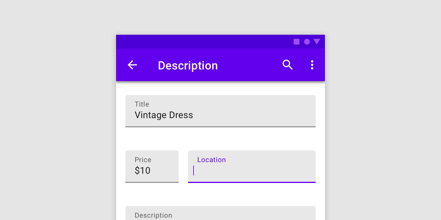
The Material specification describes how content should be displayed in cards and how each of the components should move and interact with each other. This means that an application built using Material design should not only look consistent, but should animate and flow like all other Material apps. This made Material more than just a simple UI framework and even more scientific and complete than the Apple HIG which inspired these toolkits in the first place. In many regards it was the first completely consistent open design specification.
Shortly after introducing the Material design specification, a web offering by Google was released known as Material Design Lite (MDL). Before long, there were many different Material implementations available using React, Angular, and Polymer. Some of these libraries opted for wrapping the MDL components whereas others had their own CSS that followed the Material design specification.
Recently, Google have released a new library implementing Material design known as Material design components (MDC). This new library offers both vanilla JavaScript components for use within projects and foundations developers can import into their own components. These foundations allow developers to easily implement Material design in their own library without needing to implement their own CSS and interaction logic. This new offering means that Material implementations and themes can be written in libraries such as Dojo and React without needing to wrap Vanilla JS components or rewrite styles inline with the specification. Using Material design in an application has never been easier.
Why should I use Material?
It works everywhere
Material was designed by Google as a cross-platform user interface that can be applied to almost any situation. As such, it is not out of place on a desktop, a mobile device, or a tablet. The interaction feedback and component sizing specified ensures that accessibility and usability concerns are met and that appropriate color palettes get used.
It is well documented
Material provides in-depth documentation and spec on how to lay out components and when they should get used. This saves a design team from spending precious time creating their own framework and gives developers easy to follow guidelines.
It is implemented in most popular frameworks
React, Angular and Polymer all have an implementation of the Material design specification that you can use right now within your application. Dojo too will soon have a Material theme that you can import and use with its comprehensive widget framework offering both accessibility and internationalization right out of the box.
It is highly theme-able
The MDL implementation is built using SCSS which is compiled to CSS with CSS-variables preserved. This means that you can quickly and easily override the CSS-variables it uses to tailor the look and feel to match your brand colors and work seamlessly with your current application theme.
Conclusion
Design frameworks are here to stay. Users appreciate commonality and predictability, and as a company, it is important to ensure that you have a consistent look and feel across all your applications. This is the very reason that Twitter embarked on creating Bootstrap in the first place.
Material design is currently the go-to framework for modern web applications and has even made its way onto native iOS apps via React-native Material components thus bridging the gap between the look and feel of mobile apps across Android and iOS still further.
In the future, design frameworks will need to consider the new ways users may interact with them. Virtual and Augmented Reality are becoming more popular and technologies like Electron mean that web applications and Material interfaces are finding their way into desktop applications as well as other hardware such as kiosks and televisions.
Rumors and previews of Material 2.0 have surfaced on the internet which appear to be even flatter and simplistic than before with dividing lines using less and big, bold color blocks used to direct the users attention. Time will tell what users make of these changes and if other frameworks will follow suit.
Material design will make your application look fresh and appealing to your users whilst making it quick and easy for your engineers to develop. Why not give it a go today?
If you need help getting Material working with your application, or finding the right approach to a design system for your work, please contact us to discuss how we can help!